Reducing User Drop-Off in a Core Product Feature
Jewelers working with marketplaces face a challenge: their pieces need to look appealing, and the product presentation process should be convenient for customers. This platform simplifies image management, allowing users to store, edit, and prepare jewelry photos before publishing.
About the product
Role
Product Designer
Tags
B2B, SaaS, E-commerce
Background
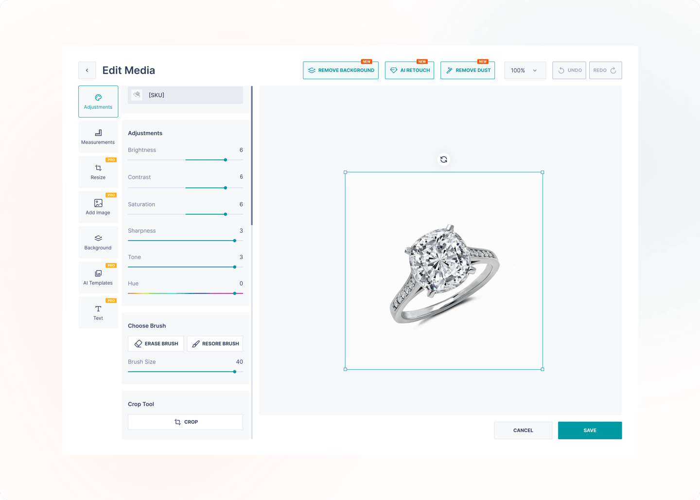
The Edit Media feature was launched as a core feature of the web application. It was intended to allow the user to store photographs of jewelry items, especially in cases where a company does not have access to a photo box to obtain quality components without post-processing. The decision was based on the assumption that part of the results would be enhancing the images using built-in editing tools, thereby maximizing the visual appeal of the products in online showcases.
Challenge
64% of users left the Edit Media feature without making any changes, indicating low engagement and potential usability issues with the tool.

Goals and objectives
Make sure users actively use the Edit Media feature, rather than just opening and closing it without doing anything.
Reduce the Exit rate by 15%.
Increase the conversion rate to saving edited media.
Make the tool more intuitive and increase user satisfaction.
Encourage upgrading to a premium plan by increasing the number of users editing photos.
Problem definition
We turned to a business analyst because there was not enough data to immediately identify specific problem points: the total number of users leaving the function was visible, but it was unclear at what stage they were doing this and what it was connected with. To get a more detailed understanding, we collected analytics on the Edit Media usage funnel and simultaneously studied support requests. Analytics allowed us to see at what steps users most often “get lost” and support gave high-quality insights into what difficulties they were experiencing when editing.

The combination of these sources showed:
Of 10,874 users who opened Edit Media, only 1,834 saved their changes.
The main losses occur at each step: only 45% select a tool, 42% apply changes and only 44% get to saving.
Users complained that they do not notice the save button, that some tools are hidden deep in the scroll, that after clicking it is not clear whether the image has been saved and also that not all functions are intuitive.
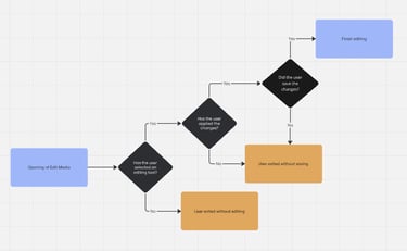
Usage User flow
Understanding User Behavior
We had some funnel data, but it only showed the steps with the biggest drop-offs, without understanding why. We formed a set of hypotheses that reflected the module’s problems: the interface was complex and overloaded, the “Save” button was visible, there was a lack of confidence in applying changes and users did not always realize they had to access the edit function.
To complete the picture, we created a user journey map. It showed a step-by-step guide of how users encountered difficulties: from opening galleries to saving images. Instead of emotional state, we captured pain points, and this required seeing real challenges: a hidden edit button, no clear indicators, an overloaded interface, insufficient visual feedback and users’ uncertainty that changes were applied. This data helped us connect quantitative metrics to specific causes and describe hypotheses.
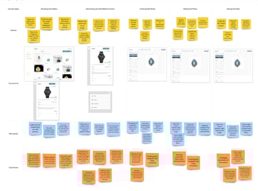
UJM
Usability testing
To test the hypotheses, we conducted moderated usability testing with 5 users. The interviews were transcribed and recorded in a Usability Study. Based on this data, an Affinity diagram was built to determine where users experienced the greatest dissatisfaction and how well the hypotheses corresponded to real problems.
The testing results showed:
Users often did not notice the "Save" button or spent time looking for it.
Some had difficulty understanding the functions and navigation, and noted that the interface was overloaded.
There was a lack of visual feedback after using the tools - there was no certainty that the changes were saved.
There were complaints about the slow operation of filters.
At the same time, some users positively assessed the logical arrangement of some elements and noted the ease of access to individual tools. (e.g. Remove background, AI retouch and Remove dust buttons)
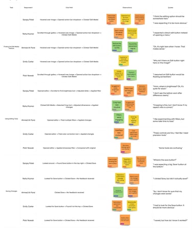
Usability Study
Solutions
Of all the hypotheses put forward, only five were confirmed. Based on them, the final solutions for improving Edit Media were formed:
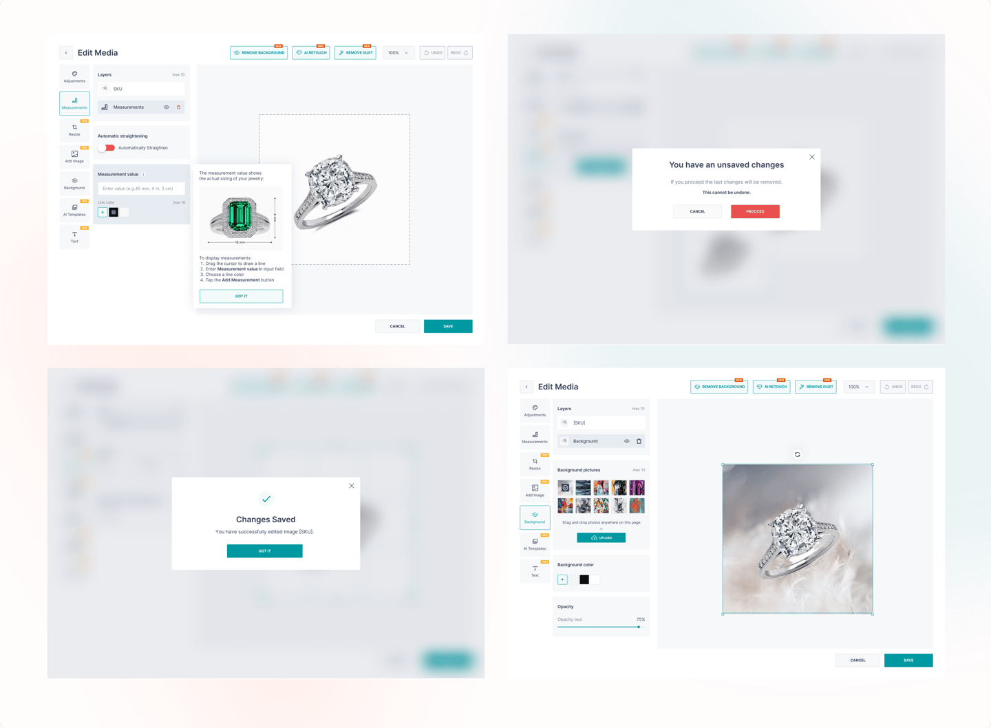
Navigation optimization
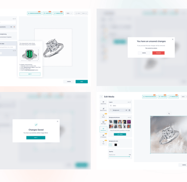
Made the ‘Save’ button fixed, more visible and placed in an intuitive location.
Onboarding with tips - added interactive tips for new users and pinned them under the “i” icon so that they could return to them at any time.
Confirmation screen after saving - introduced a success screen so that the user could see the result and feel the completion of the process.
Warning when exiting without saving - added the worrying message, which reduced the risk of accidental data loss.
The Outcome and Next Steps
After making the changes, we were able to achieve the goals set earlier:
Reduce bounce rates - users began to use the function more actively: the exit rate decreased from 64% to 40%, exceeding the target goal.
Increase conversion to save - the rate almost doubled, from 18% to 35%.
Make the tool more intuitive and increase satisfaction - simplified navigation, onboarding and feedback allow us to reduce the number of complaints and improve the understanding process.
Stimulate the transition to a premium plan - increased engagement and retention of the value-enhancing function, which means motivating users to purchase advanced features.
Next Steps:
Run A/B tests to clarify the impact of each change.
Review onboarding extensions for advanced features to support users in their next steps.
Despite the positive metrics, pay attention to the placement of the Edit Media login button: during interviews, users noted that it is not always easy to notice. This may be a barrier to increasing engagement.