Core Coverage MVP on a Small Budget
Role
UX/UI Designer
Project background
Tags
FinTech, MVP, Mobile App
Before the app, car insurance mainly involved long-term policies. The client's idea was to issue a policy for 1 hour on the go, to eliminate overpayments for unused time. The budget was limited, and the client decided to be a subject matter expert, playing a key role in shaping decisions throughout the process.
Understanding the Domain
Before jumping into features or interface decisions, I needed to understand the fundamentals of car insurance as a domain. Since I had no prior experience in this field (and am not a driver myself), it was critical to build a knowledge base from secondary sources.
I turned to publicly available reports and legal guidelines from government portals, industry whitepapers and statistical platforms to get a broader sense of how digital insurance operates today.
My goal was to answer basic but foundational questions:
What is car insurance, and what types are most common?
What are users legally required to provide when purchasing insurance?
What do users expect from an insurance app today?
Based on my research, I learned that car insurance is a legal requirement in most countries. The most common types are third-party liability (mandatory), third-party with fire and theft and comprehensive coverage. Some insurers also offer temporary or usage-based insurance.
Users are typically required to provide personal details, driver’s license information, vehicle data and intended usage. In some cases, proof of ownership or other documents may be required.
In terms of expectations, users at that time look for a fast and simple process, transparent pricing, autosave functionality, flexible payment options, easy access to their policy, support features like chatbots or FAQs, light personalization and strong data security.
Competitive Audit
With foundational knowledge from field research in place, I turned to competitor analysis to define the core of our MVP. It was important to understand:
What solutions already exist on the market?
How do competitors solve user problems?
What functions are there in existing products?
What best practices can be implemented in our application?
Baseline Functionality
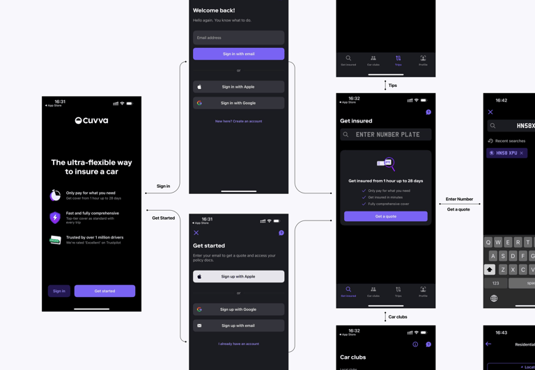
To identify the non-negotiable components of the MVP, I conducted a functional walkthrough of multiple European car insurance apps - Allianz, AXA Drive, Cuvva, Generali and MAPFRE, focusing on what screens, inputs, and modules appeared consistently across products. This wasn’t a formal benchmarking exercise, but rather a structural mapping based on repeated patterns observed during manual exploration of real apps.
Heuristic Evaluation
I conducted a heuristic analysis to assess how user-friendly competing apps are.
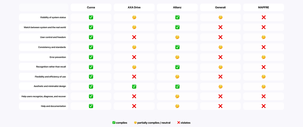
While conducting the heuristic evaluation, I noticed that many competitors struggled with consistency and clarity. For example, Generali used inconsistent terminology across screens (“Start Application” vs. “Create New Contract”), which could easily confuse users. AXA Drive, on the other hand, lacked progress indicators and forced users to recall previous steps, rather than supporting recognition. These patterns highlighted the importance of designing clear, predictable flows and ensuring the interface supports users at every stage. This evaluation helped me identify what to avoid and what to prioritize in our own MVP experience.
Analyzing competitor reviews and identifying user pain points
To understand the real problems of users, I analyzed reviews in the App Store and Google Play for competitive insurance apps. I filtered negative (1-3 stars) and positive (5 stars) reviews to identify the main pain points and positive moments.
Most negative reviews are related to the lengthy registration process, the complexity of the interface and the lack of autosave. Positive reviews note the speed of registration and the convenience of managing policies. Users encounter inconvenient rates, difficulty uploading documents, an overly long registration process and a lack of convenient payment methods.
Feature Benchmarking
After identifying pain points and UX issues across competitor products, I sought to understand what additional features and interface patterns were being employed to address or mitigate those problems.
I combined these perspectives to define a set of comparison criteria and grouped them into four key areas:
UI — visual clarity, hierarchy, brand compliance.
UX — navigation, insurance flow design, interaction patterns.
Functionality — registration, quote logic, payment flow.
Additional features — personalization, chatbots, automation, gamification.
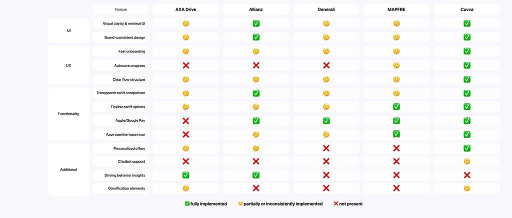
The goal of the benchmarking process was to identify which additional features and interface patterns competitors use to address or avoid the UX problems and user pain points identified earlier.
Autosave, payment flexibility, transparent tariff comparison and fast onboarding were often absent or only partially present. Even support features like chatbots or personalized offers, which are increasingly standard in other industries, were rare.
This revealed a gap between what users expect and what the market delivers. It gave me clear direction on what needed fixing, what was worth borrowing and where we could genuinely stand out.
From this, I extracted a set of baseline modules that form the foundation of any functional insurance experience:
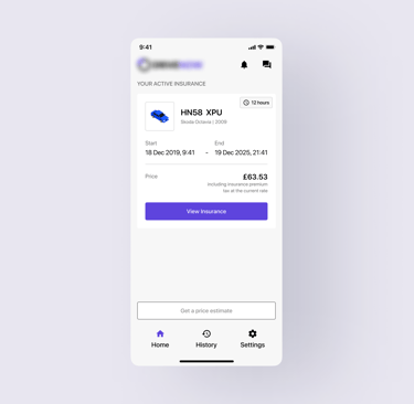
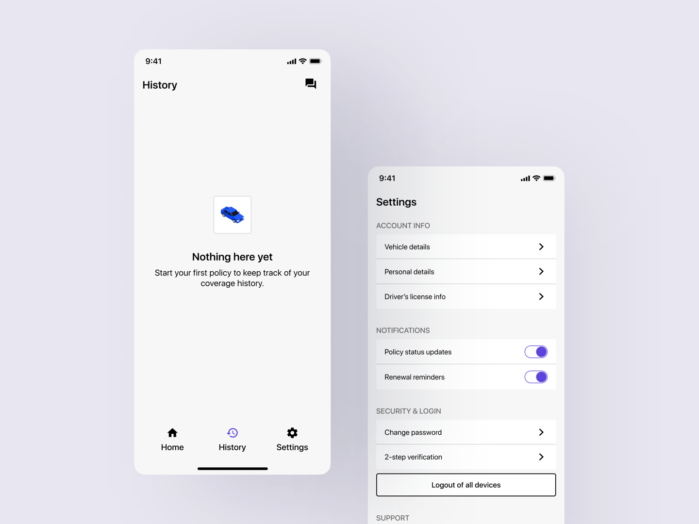
Registration and login
Policy purchase
Profile and saved data
Policy overview
History
Settings
This helped anchor the scope of our MVP in reality, rather than assumptions, even without access to end-users.
Heuristic Evaluation
CUVVA Screen Map
Feature Benchmarking
After conducting a detailed analysis of competitors, I was able to gain a deeper understanding of how users interact with car insurance services. Despite the diversity of solutions on the market, most products face the same problems.
The first thing that caught my eye was that the insurance process for competitors is overloaded and inconvenient. Users complain about complex forms, long steps and the need to manually enter too much data. This makes them either postpone the purchase or look for a more convenient solution. For our MVP, it is important to provide automatic data filling and a reduction in the number of steps.
I was also surprised that even large players do not always offer automatic data saving. Losing the entered information forces people to start the process over again, which is extremely annoying. We can avoid this mistake by adding automatic saving of completed data.
Another critical point is payment methods. Not all applications support Apple Pay, Google Pay or the ability to save a card, which makes the final step of purchasing insurance inconvenient. If users have already decided to buy a policy, the payment process should be fast and without unnecessary barriers.
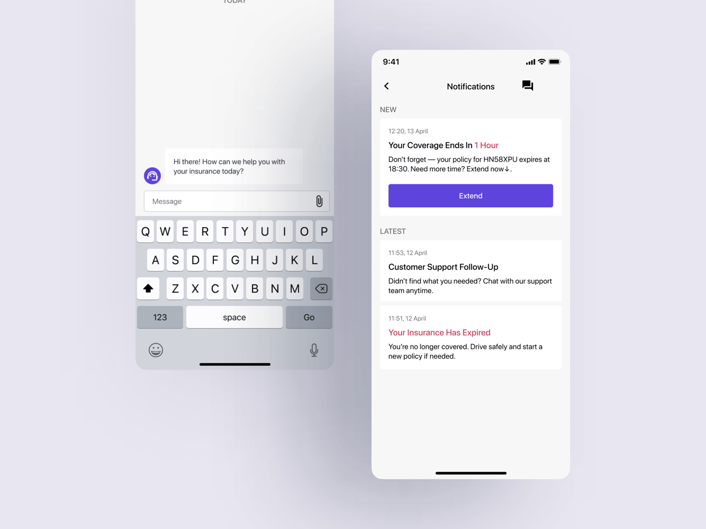
Customer support deserves special attention. Many competitors face negative reviews due to long wait times for a response or lack of clear instructions. To make our product trustworthy, we can implement a fast chatbot that will help resolve simple questions and the ability to instantly contact an operator.
Finally, personalization is a factor that distinguishes strong products from average ones. Market leaders such as Cuvva already use flexible tariff settings adapted to the user. We can consider the possibility of personalized offers and recommendations, which will increase user engagement.
Problem Statement
Defining User Scenarios
Before designing flows or wireframes, I needed to define the key user scenarios that the MVP would support. These scenarios represent real user goals - not just what the system offers, but what people are trying to do in context.
To ensure the scenarios reflected reality, I relied on several layers of prior analysis:
Baseline Functionality helped me identify the essential flows every insurance app must support( such as registration, policy purchase, and profile management).
User Pain Points uncovered the steps where users often experience friction (such as long forms, unclear pricing, or missing autosave).
Feature Benchmarking revealed which features were expected by users and where our MVP could improve on common gaps (for example, flexible payments or embedded support).
By combining these findings, I was able to shift from a feature-based mindset to a process-based one.
Each scenario I defined answers a question like:
“What is the user trying to do here?”
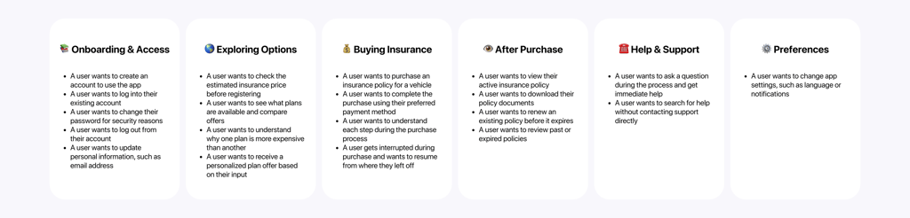
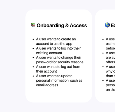
To structure this, I grouped the resulting scenarios into six product contexts:
Onboarding & Access, Exploring Options, Buying Insurance, After Purchase, Help & Support and Preferences.
These scenario groups became the foundation for building clear, user-centered flows, ensuring every step was grounded in real goals, not just technical structure.
User Scenarios
Creating User Flows
After defining the core user scenarios, I began translating them into a product structure - mapping out flows, grouping functionality by context and making decisions on what would be visible, when and why.
My goal was to create an experience that directly reflects the user's goals and emotional states in each scenario, whether they’re in a rush, just browsing or renewing something they already understand.
Each scenario helped me identify a focused set of needs, which in turn informed specific UX decisions. For example, users who need insurance urgently are taken through a fast-start flow with auto-filled inputs and instant payment. Those comparing options are presented with plan cards that emphasize clarity and side-by-side differences. Returning users can quickly review and renew existing coverage without re-entering data.
To stay aligned with the earlier hypotheses, I ensured every solution tied directly back to user pain points, whether it was adding autosave to reduce drop-offs or using simplified language to support decision-making.
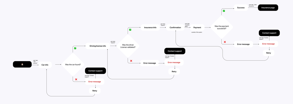
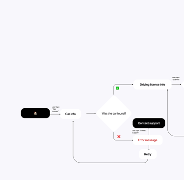
I created dedicated user flows for all three scenarios, ensuring each reflects its respective user mindset and supports the key hypotheses identified earlier. While the first-time purchase flow is detailed above, the other flows — for plan comparison and policy renewal — were also fully mapped and optimized using the same design logic: minimal friction, transparency, and contextual support.
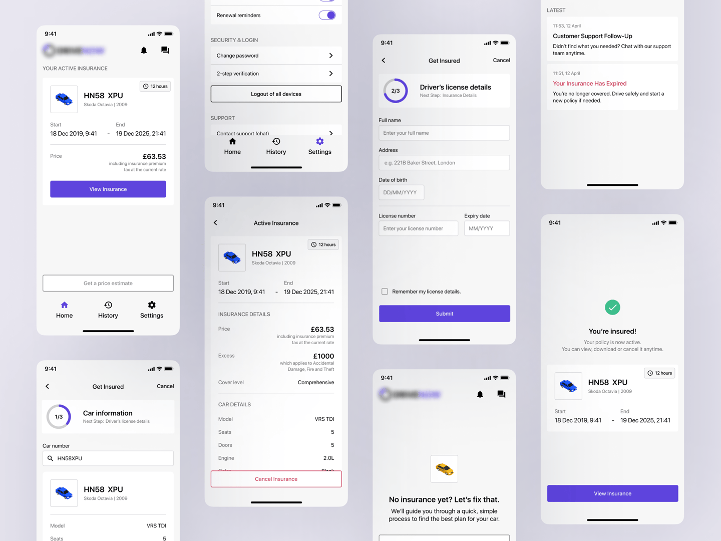
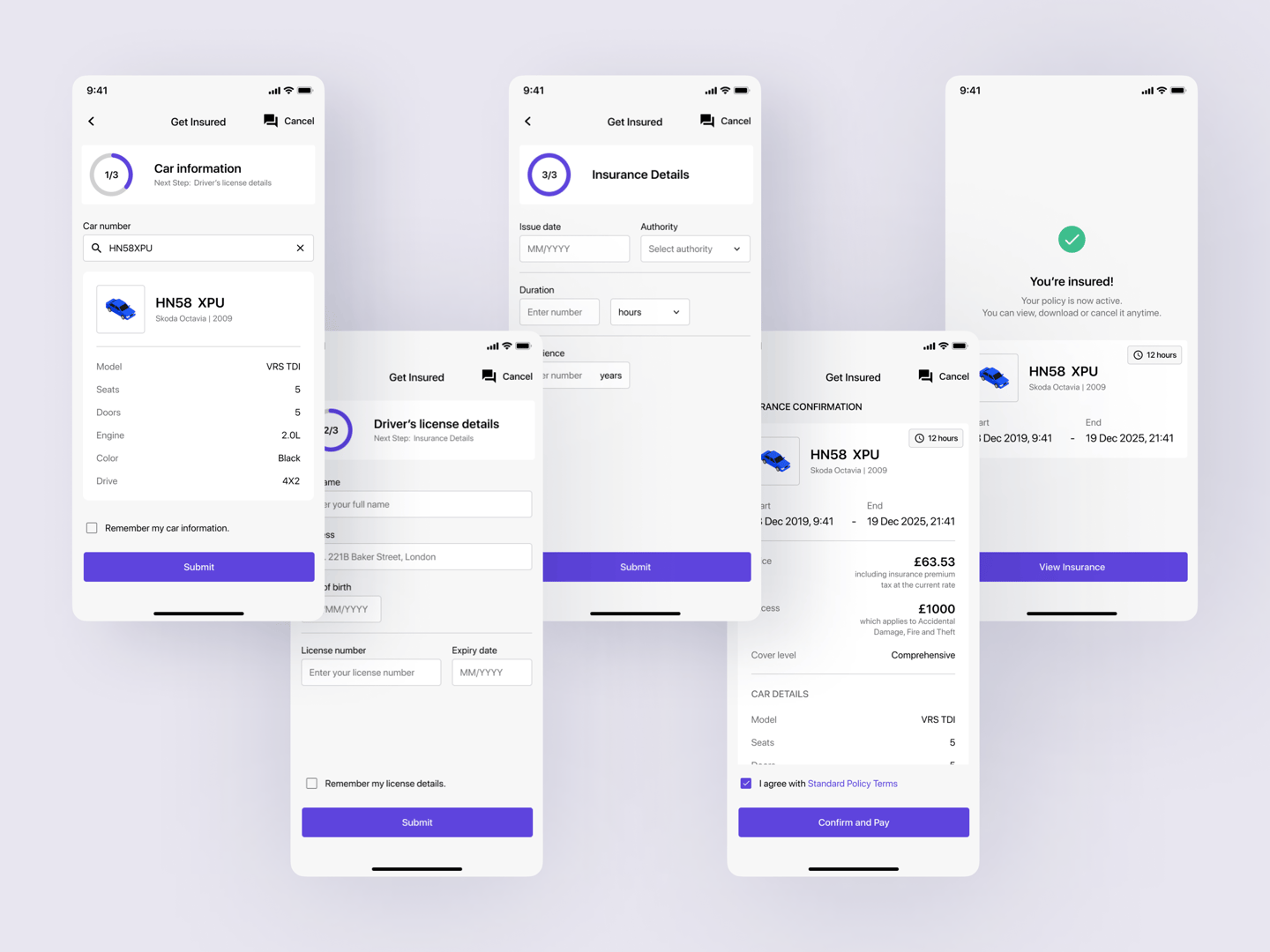
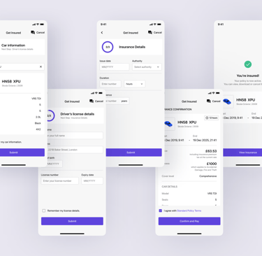
Getting Insurance from scratch flow
Wireframes
Wireframes became a way to quickly assemble the framework of the entire system when neither the team nor the customer were completely sure what the product would look like in real life. We couldn’t afford long UI design cycles, much less expensive prototypes — we needed to make sure that the logic worked, that steps weren’t lost, and that the structure didn’t fall apart in an instant. Using wireframes, I checked how the system behaved if a user came without an insurance policy, if they interrupted the process, if they had a loading error. For example, on the driver’s data addition screen, I provided two paths at once: quick photo upload and manual entry, with a separate modal state in case of an error.
Thanks to this, it became clear that even the basic version of the application could remain coherent and understandable — without unnecessary weight and with minimal confusion on the screen. These screens became not just a visual reference point, but a way to agree with the team on what and why we were building.
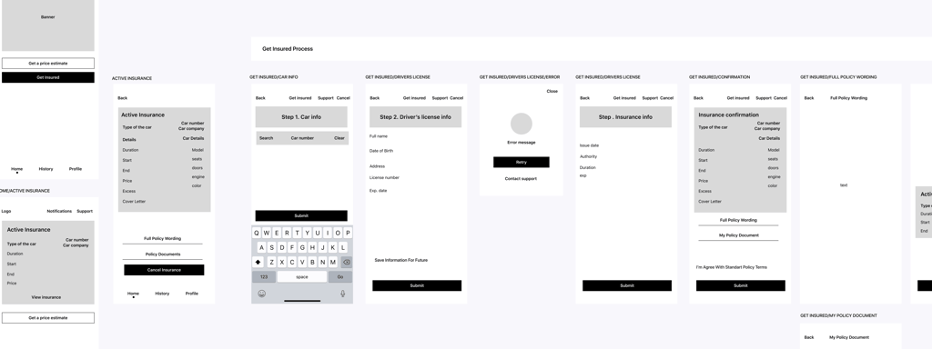

Home page and Get insured from scratch wireframes
UI Kit
Creating a UI Kit wasn’t just a stylistic move - it became a tool for coordinating visual decisions and speeding up work on final screens.
Since the deadlines were tight, I addressed the colors, typography, and behavior of the main components in advance, ensuring I wouldn’t have to revisit these issues later. Styles were set for buttons, fields, error states and disabled states, so that the user always understood what was happening on the screen, even with minimal visual cues.
I built the entire system on an 8pt mobile grid and pre-defined borders and radii - to maintain a clean visual structure as the logic expanded.
Thanks to this UI Kit, each new screen was assembled quickly and consistently. I didn’t have to guess which style to choose, and the team was able to accept changes on prototypes more quickly.
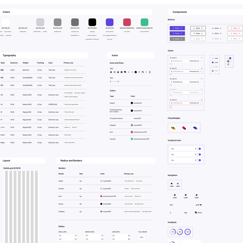
Application UI kit
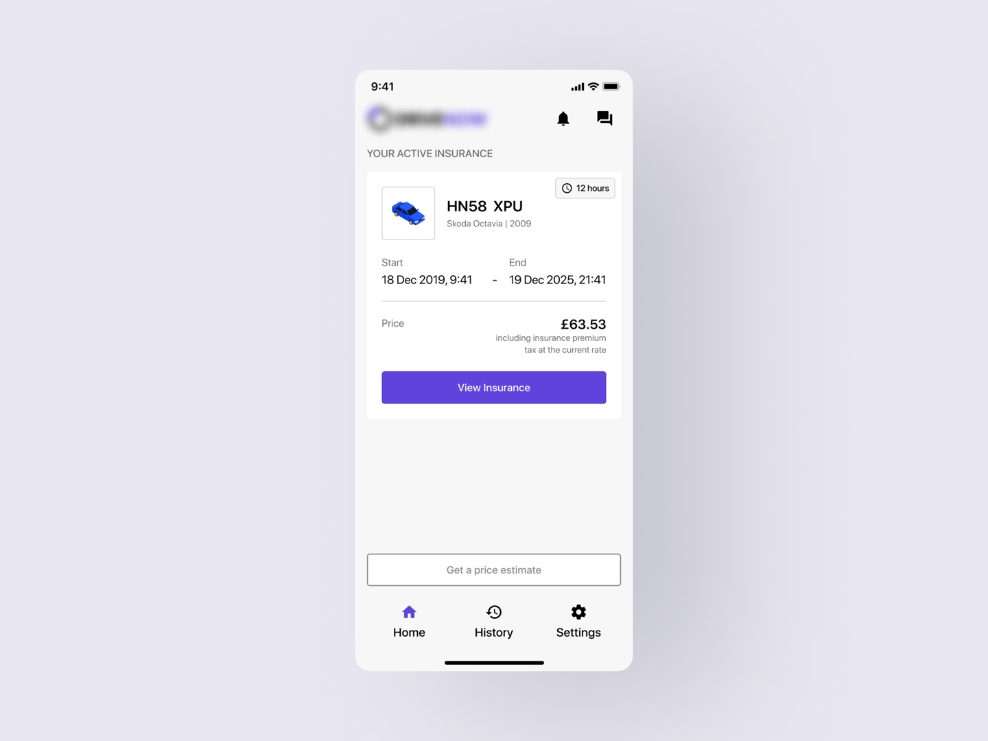
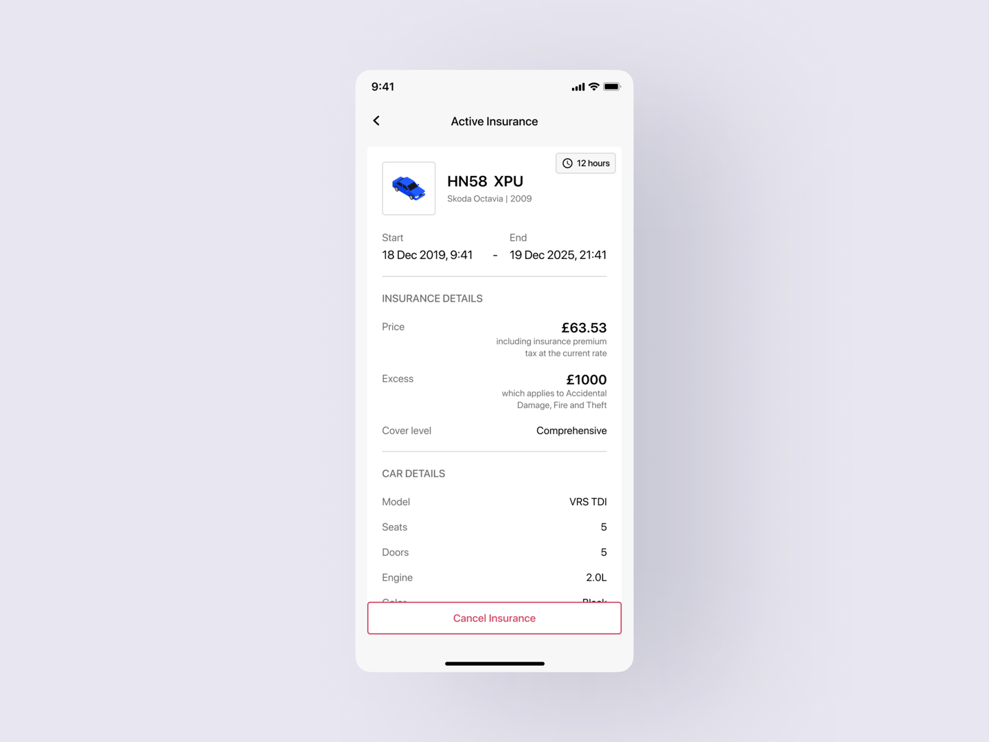
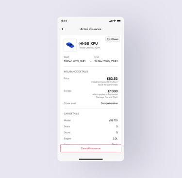
Final Design and prototype
After all the preparatory stages were completed, I started assembling the screens. Thanks to the pre-designed wireframes and UI Kit, the process was quick and smooth: the structure was already verified and the visual styles were ready. This allowed us to focus on the details of interaction and visual clarity, without wasting time on unnecessary sorting of solutions. In addition to the finished screens, I also assembled an interactive prototype - it became a key tool for the customer in negotiations with potential investors.
What I Would Improve Today
Looking back, I see several opportunities to strengthen both the process and product, if time, budget or access to users were not constraints.
1. I would push for direct user contact (even in a limited, informal way).
While I thoroughly analyzed competitors and user reviews, this information couldn’t fully replace real behavioral insight. Even short remote interviews or lightweight usability tests with 3–5 real users, professional drivers, policyholders or even insurance call center agents could have added crucial context to decisions.
2. I would set up a scalable visual system from day one (using tokens and variables).
Back in 2021, Figma didn’t yet support design tokens or variables the way it does now. Today, I would define foundational tokens (colors, typography, spacing) and component aliases early on. This would ensure a scalable, consistent visual system and reduce the need for repetitive decisions when building new screens.
3. I would prototype earlier (not just polish at the end).
We did build a final clickable prototype to support investor conversations, but if I were doing this today, I’d introduce low or mid-fidelity prototypes much earlier. This would allow for faster flow testing, better decision-making about interaction details and less risk of late rework. During the original project, we prioritized wireframes and static designs due to time constraints, and interactive flows only came in at the final stage.
4. I would prepare for handoff and scale (even in a small project).
Though our UI Kit made assembly fast, it existed only in visual form. Today, I would complement it with a lightweight spec: usage guidelines, interaction rules, spacing logic and edge case handling. This kind of documentation, even for MVPs, helps the team move faster and avoids ambiguity during development.
This project provided me with a hands-on opportunity to build an MVP, from research to UI, within tight constraints, while maintaining full ownership. It challenged me to stay pragmatic, move fast without losing structure and make each decision count.
Working without direct user access meant relying on sharp analysis, good questions and ruthless prioritization. In the end, it taught me how far you can go when you design with intention, even inside real-world constraints.