Designing a Complete Crypto App From Scratch
Role
UX/UI Designer
Tags
FinTech, Crypto / DeFi, Mobile App
Project Background
At the time, I was working in a company that specialized in crypto projects. One of our clients explored the idea of building an all-in-one crypto platform and I had the opportunity to experiment with early concepts. While the client project didn’t move forward, I decided to develop the idea further as a portfolio case study.
Understanding the domain
Because this was a portfolio project, I didn’t have direct stakeholders or user data to begin with. Instead, I had to build my knowledge of crypto finance and DeFi applications from secondary sources.
I studied articles on cryptocurrency adoption, DeFi trends and competitor platforms (Coinbase, ZenGo, Public.com) to answer foundational questions:
How do people currently manage and use crypto assets?
What functions are considered “must-have” in a crypto app?
Where are the usability and trust gaps in existing solutions?
From this initial research, I learned:
Security and transparency are the top user concerns when dealing with crypto.
Most mainstream apps silo functionality (wallet, exchange, staking, loans) across different platforms, creating friction.
Trust is built not just through technology but also through clear UX: people want to see what’s happening with their money in real time.
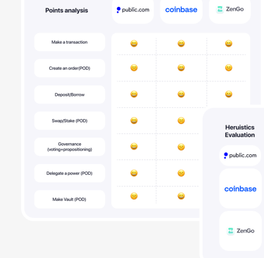
Competitive Audit
To define scope, I conducted a lightweight competitor analysis of apps like Coinbase, ZenGo, and Public.com. I focused on their functional breadth, UX patterns and common usability pitfalls.
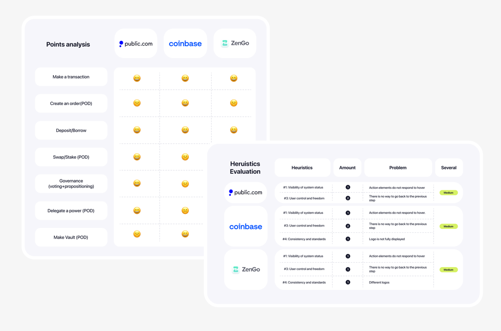
Findings
The competitor analysis revealed several recurring issues.
Many platforms lack a clear way to cancel or go back during transactions (breaking Nielsen’s Heuristic #3).
Buttons, logos, and menus often do not respond to hover or tap, which violates Heuristic #1 (visibility of system status).
Most apps provide only part of the functionality (wallet or staking or lending), requiring users to jump between tools.
Best practices identified
Despite these shortcomings, there were also valuable practices worth noting. Public.com, for example, stood out with features like swapping, staking and governance participation. These elements demonstrated how a platform could extend beyond basic transactions and enrich the overall user experience.
These insights showed me where application could stand out: by unifying features into one cohesive, secure and minimal product.
Competitive Audit
Problem Statement
Despite dozens of crypto platforms, users face recurring issues:
Disjointed experiences: managing assets requires multiple apps.
Low usability standards: unclear flows, missing states and lack of feedback erode trust.
Complex financial actions: users struggle with unclear loan conditions, deposit interest calculations and transaction steps.
For the application, my goal was to:
Consolidate essential crypto functions into one place.
Provide clarity and transparency at every step.
Reduce friction in financial flows without sacrificing security.
Defining Target Audience
Because this was a portfolio project, I didn’t have access to real customers or stakeholder data. To still ground my design in reality, I created proto-personas using:
Market research
Crypto adoption reports, articles on financial independence and demographic statistics about typical crypto investors.
Competitor reviews
Analyzing App Store and Google Play feedback for platforms like Coinbase, ZenGo and Public.com to understand real user frustrations and positive experiences.
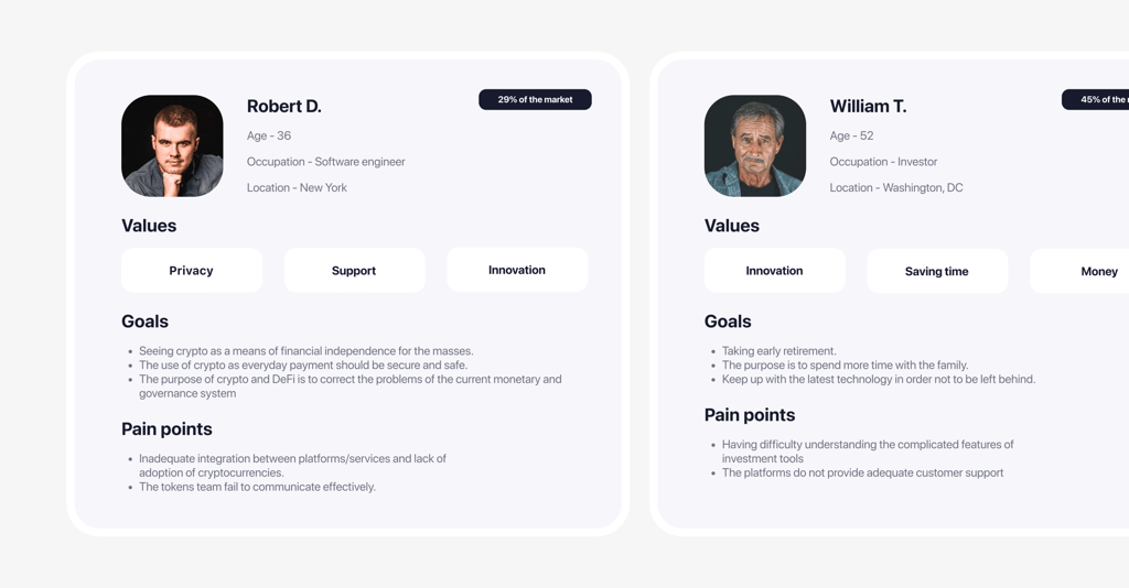
Proto-personas
From these inputs, I shaped personas that reflect typical crypto users: interested in innovation and independence, motivated by financial growth, but cautious about security and frustrated by fragmented or confusing app experiences.
These proto-personas gave me a structured way to keep design decisions user-centered, even without direct user access.
Information Architecture
Once I had a clearer picture of who the users might be and what they value, I needed to translate that into a structured product foundation. Jumping directly into wireframes would have been risky: without clarity on how features connect, the app could easily become inconsistent or overwhelming.
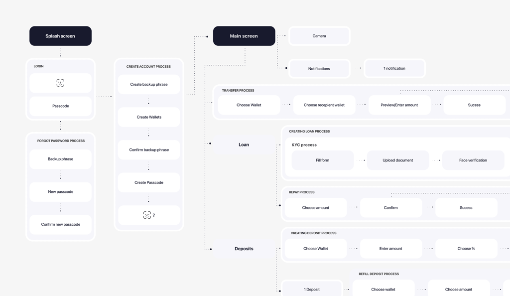
Information Architecture
The IA brought together all the main processes - onboarding, wallet creation, transfers, deposits, loans and repayment flows. By mapping them step by step, I could see how the product would handle sensitive flows like KYC verification, backup phrase creation, and passcode recovery, alongside everyday actions like sending funds or creating deposits.
This stage gave me a full overview of the product’s structure, confirming that all core crypto functions were covered. It showed where flows overlapped (e.g., “choose wallet” and “enter amount” repeated across deposits, transfers, and withdrawals), which later helped me design reusable components and maintain consistency.
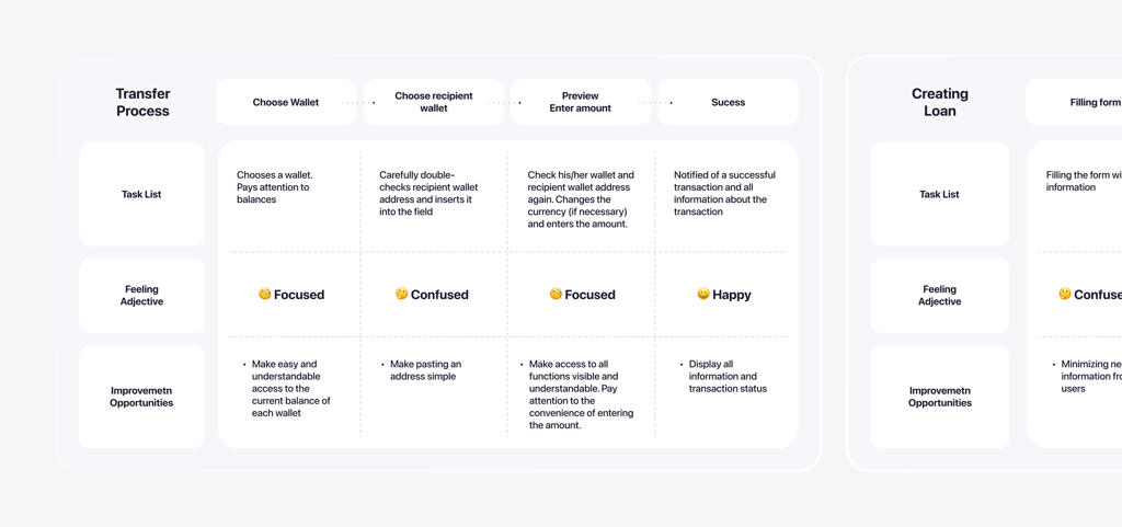
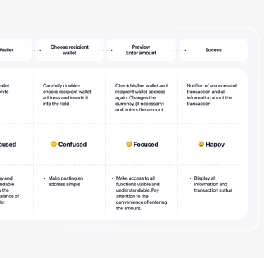
Once the Information Architecture was in place, I needed to see how it would behave in real use cases. For that, I created user journeys - hypothetical step-by-step paths that showed how someone might transfer funds, add a deposit or request a loan.
These journeys were not based on direct observation, but on the proto-personas I had built earlier and on patterns I noticed in competitor reviews. For example, users often complained about confusing loan conditions or unclear document requirements, so I mapped those stages carefully to highlight where friction could appear. On the other hand, people consistently appreciated clear confirmation messages, so I treated successful completion as an important milestone in every flow.
User Journeys
UJM
This stage helped me pinpoint critical risk areas in the journeys (address input, document upload, loan explanation) and identify trust-building moments (transparent calculations, success screens). It gave me a checklist of design priorities before moving into wireframes, ensuring that clarity, error handling, and confirmation states would be baked into the structure of the app
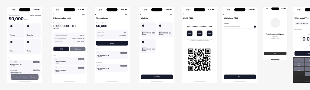
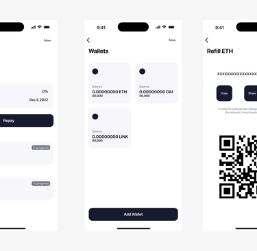
Wireframes
Building on the IA and journeys, I translated flows into wireframes . Each screen represented a key step — from choosing wallets and entering amounts to loan KYC verification and success/failure states. The focus was on layout, hierarchy, and feedback, rather than visuals.
The wireframes proved that the logic of flows held together across different scenarios: whether a transaction failed, a deposit was created, or a loan application stalled at verification, users would not get lost. They also gave me a way to refine the balance between automation (like prefilling amounts) and user control (manual checks before confirmation). This became the backbone for the visual design phase.
Wireframes
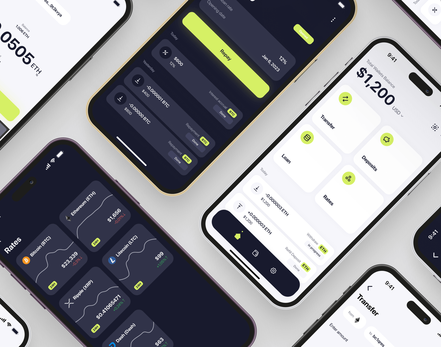
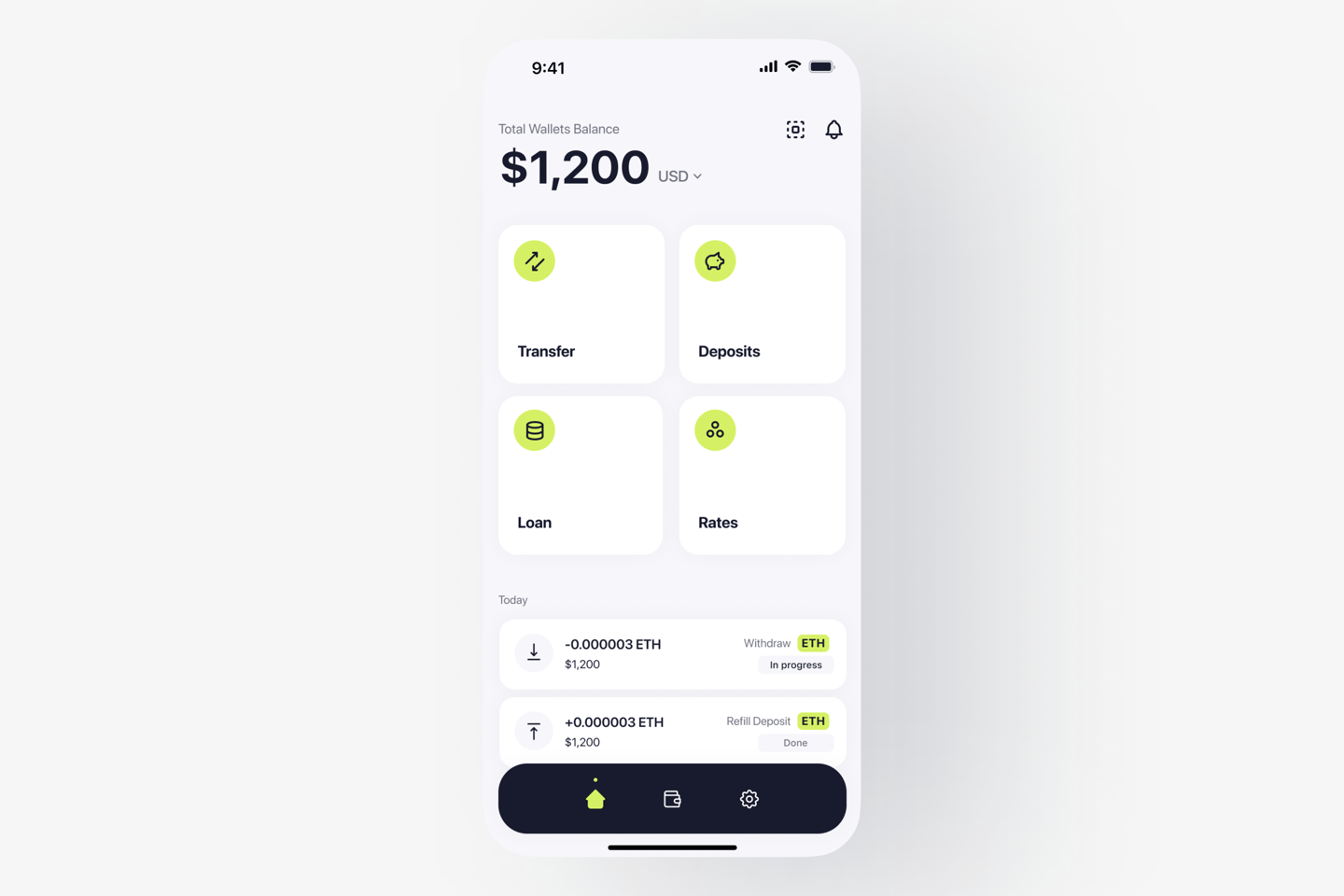
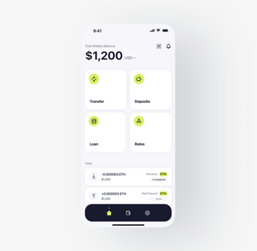
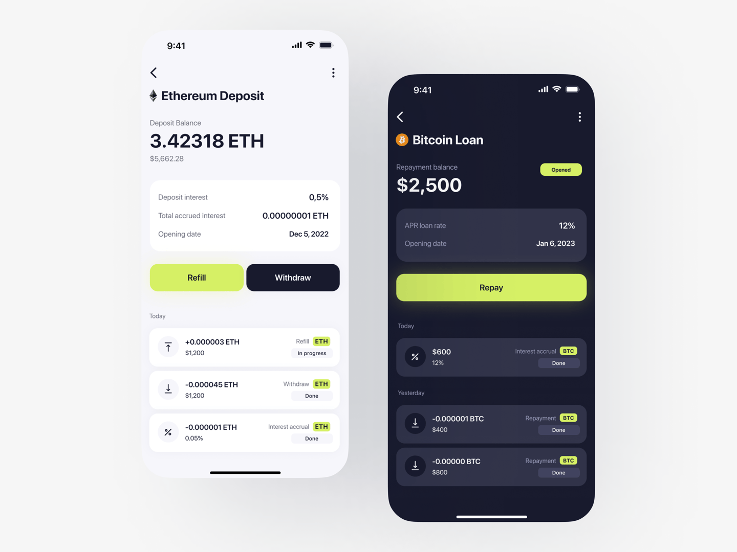
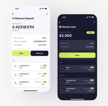
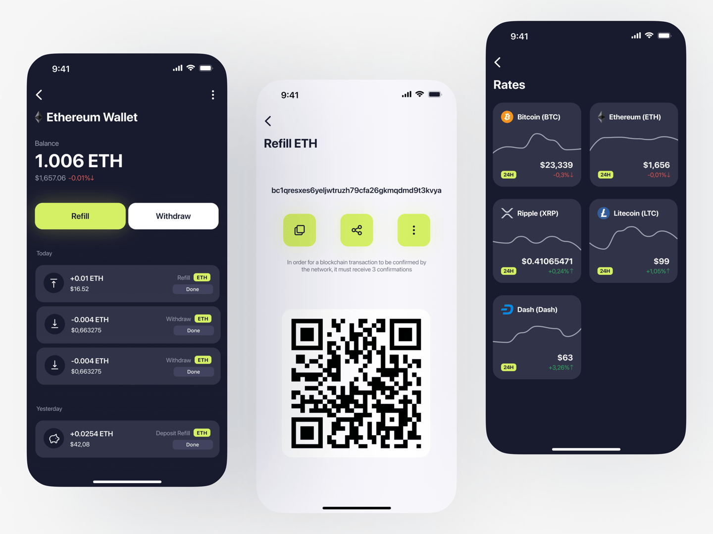
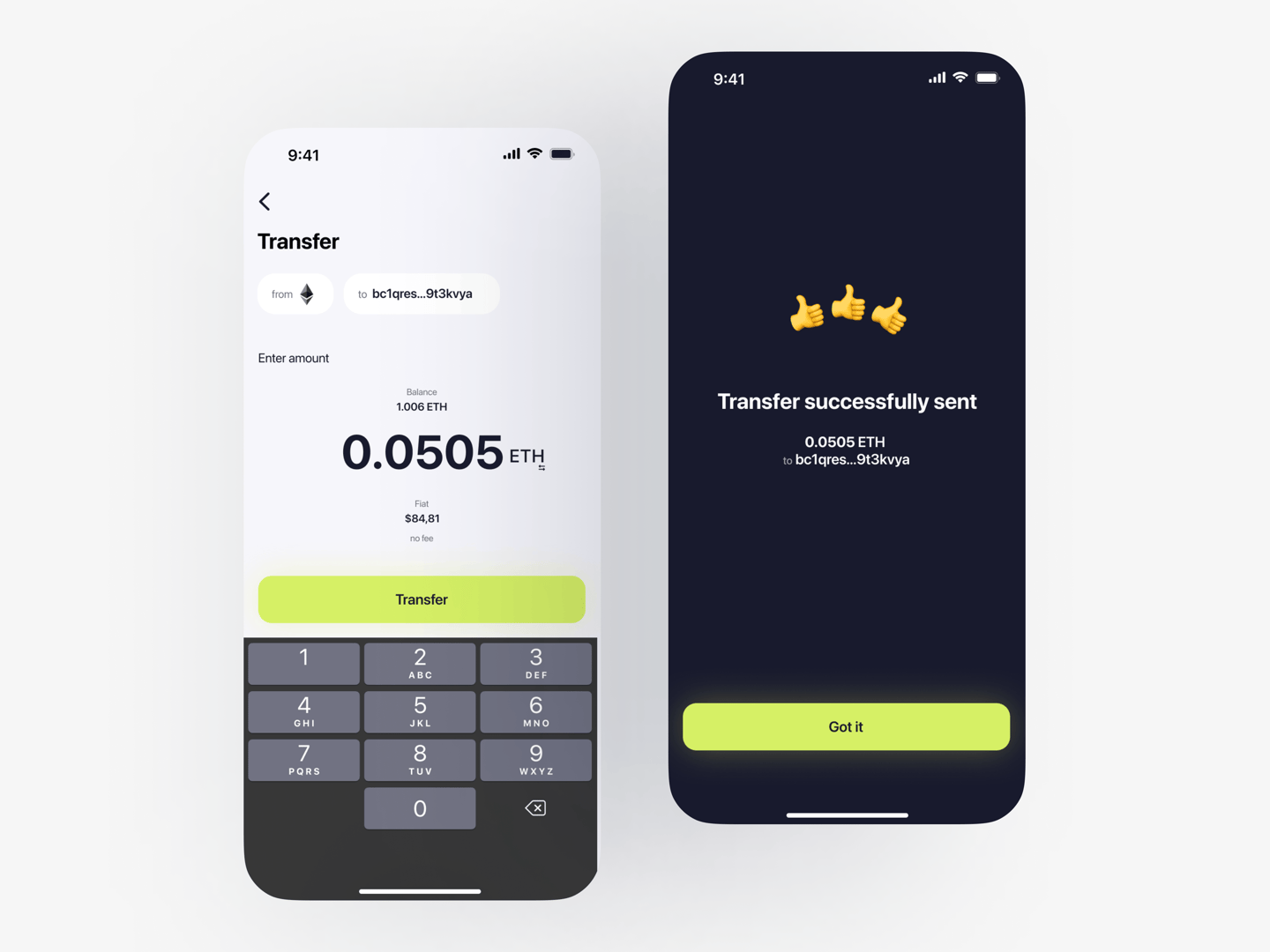
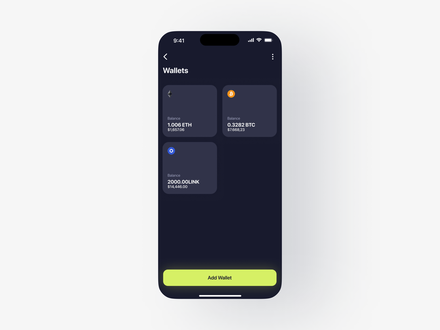
Visual Design
After wireframing, I created the visual design to bring clarity and trust to complex financial actions. I designed two themes — light and dark — so users could choose what fit their context best. At that time (2020), Figma didn’t yet support variables, so maintaining both themes meant duplicating styles manually. This was more time-consuming, but it also gave me experience in keeping design consistent across two parallel systems.
Sile was a portfolio project, not a live product, but it gave me the space to practice working through a complete process - from understanding the domain and competitors, to shaping information architecture, user journeys, wireframes and finally visual design.
Even without real users or a product team, I treated each stage as an opportunity to test how I think, structure problems and translate insights into design decisions. The result was a concept that brought together core crypto functions into a clear, minimal experience, while also teaching me lessons I’ve since carried into real-world projects - especially around scalability, system thinking and the importance of validation.