Optimizing Jewelry Photo Editing
September 2023 - Digis project
Jewelers working with marketplaces face a challenge: their pieces need to look appealing, and the product presentation process should be convenient for customers. This platform simplifies image management, allowing users to store, edit, and prepare jewelry photos before publishing.
Duration
8 weeks
Role
Product Designer
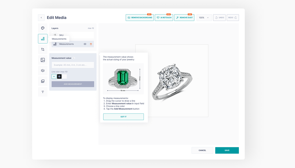
In addition to managing visual content, jewelers can create catalogs, share them with clients, and use an AI-powered virtual try-on feature. This makes the selection process easier and helps customers make purchase decisions faster.
Project Tags
B2B, SaaS, E-commerce
The Discovery
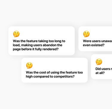
I reached out to the tech team to check if there were performance issues. Everything was running smoothly. The marketing team confirmed that the feature had been properly promoted. Yet, when I looked at user analytics, I saw that while some users interacted with Edit Media, many abandoned it soon after opening.
Customer support provided another key clue - users were reaching out with questions about how to use Edit Media. This meant they were interested but confused. The problem wasn’t that users didn’t need the feature - it was that they struggled to use it effectively.
With this realization, I needed to dive deeper. I analyzed how users navigated through Edit Media and mapped out their journey. Where were they hesitating? At what point did they drop off?
Understanding User Behavior
Realizing that usability was the real issue, I needed to go deeper. I mapped out how users navigated through Edit Media, identifying where they hesitated, where they became frustrated, and where they ultimately abandoned the feature.
Analyzing these behaviors, I began forming hypotheses on what could be causing friction. Was the button too difficult to find? Was the navigation too complex? Did users not understand the editing process? Each hypothesis provided a potential angle for improvement, but I needed data to validate them before making any changes.
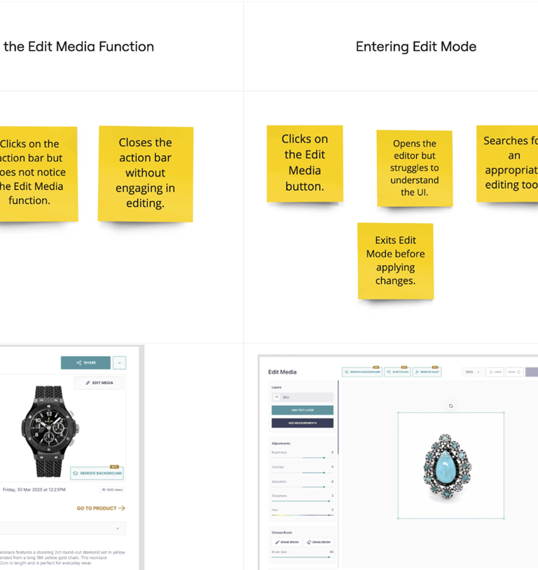
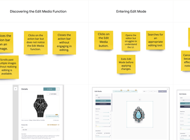
After evaluating the flow, I outlined hypotheses for potential friction points. Perhaps the button was too hidden, the navigation too complex, or the editing process unclear. Some solutions seemed straightforward - improving visibility, adding tooltips, simplifying navigation - but before making changes, I needed to validate them.
Testing and Refinement
To confirm my assumptions, I conducted Moderated Usability Testing, observing users as they interacted with the feature. The results were telling—9 out of 17 hypotheses were correct.
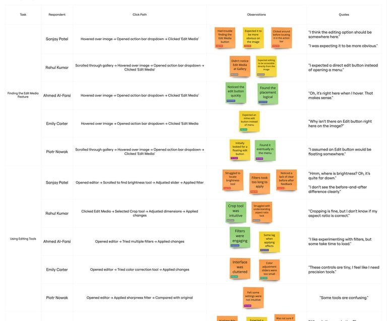
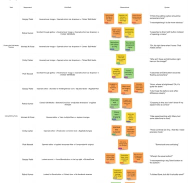
Some issues were easy to fix, like making the Edit button more prominent. Others required a more thoughtful approach. For example, users frequently exited without saving their edits, which indicated that they either didn’t realize they needed to save or simply forgot to. Addressing these challenges required a mix of UI enhancements and guiding prompts.
Solutions
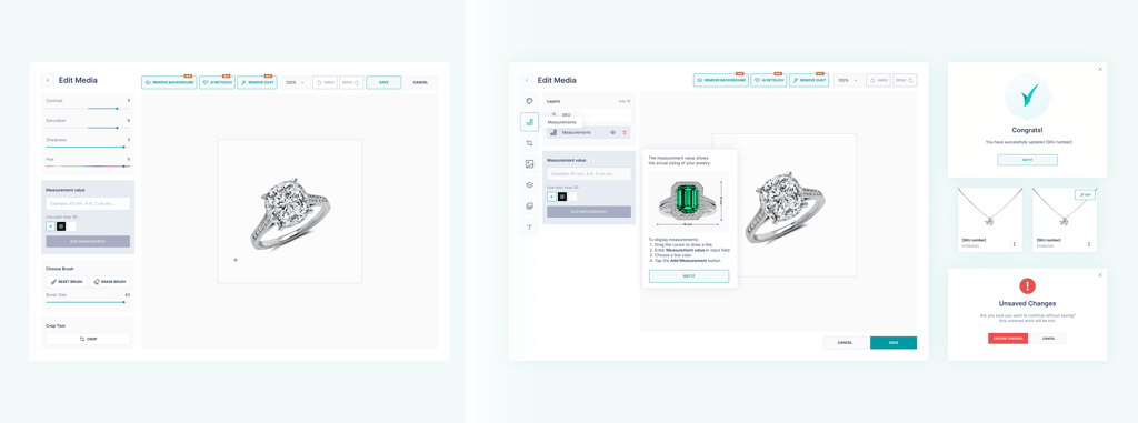
With clear insights, we identified key usability issues and implemented targeted improvements to streamline the user experience.
The Edit Media button was moved to the image card, making it instantly accessible.
An icon was added to the button, improving its visibility.
Navigation was optimized, reducing unnecessary complexity.
Onboarding tooltips were introduced, guiding new users through the process.
The Save button was repositioned to ensure users could easily locate it.
A success confirmation screen was added to reinforce task completion.
A warning prompt before exiting unsaved edits was implemented to prevent accidental loss.
The Outcome and Next Steps
With these enhancements in place, we approached the next phase strategically:
Quick Wins—rolling out immediate improvements with minimal development effort.
A/B Testing—experimenting with interface variations to fine-tune the experience.
The results spoke for themselves. Users now engaged with Edit Media more intuitively, reducing drop-off rates and improving overall adoption. By focusing on usability, we transformed an underutilized feature into a seamless part of the user workflow, making jewelry editing easier and more efficient than ever before.