Car Insurance App MVP
March 2021 - Idealogic project
Car insurance in Europe can be complex and time-consuming. This MVP was built to simplify the process through a fast, mobile-first experience with clear plan options and instant online payment.
Duration
8 weeks
Role
UX/UI Designer
The app was designed to guide users through vehicle info, driver details, plan selection, and payment — all within minutes. Built around legal requirements and common industry practices, it prioritized functionality, clarity, and ease of use, even in the absence of direct user feedback.
Project Tags
B2C, MVP, Insurance
Stakeholder Interview
The client approached us with a simple idea: to create a mobile app that would allow users in Europe to purchase car insurance quickly and easily. There was no documentation or product definition — just a broad goal to enter the insurance space with a streamlined digital experience.
In our initial conversation, I asked basic discovery questions to understand what the client envisioned. The information provided was minimal, but a few key directions were clear:
The product would be a mobile application;
Users must be able to complete the process and pay online;
The flow should be fast and easy to use;
It must comply with local legal requirements;
Insurance pricing would be calculated automatically based on car information, insurance duration, driver experience, and regulatory authority data — not selected manually by the user;
The MVP would support two vehicle types: vans and taxis, with ordinary passenger
cars planned for a later phase.
With no business analyst or product owner on the team, I took ownership of defining the product flow and feature scope, working closely with developers and using external research to shape the MVP direction.
Understanding the Domain
Before designing the product, I needed to understand the context in which it would be used. This included the basic role of insurance in drivers’ lives, legal requirements across Europe, and the current digital landscape of insurance apps. My research focused on three key areas:
Basics of the Industry
Drivers need insurance not just because it’s legally required, but because it protects them from financial loss, legal consequences, and work disruption. For commercial drivers, especially those using vans or taxis, insurance plays an even more critical role. It allows them to operate their vehicle legally and maintain their income stream. If they’re uninsured, they’re off the road — and out of work.
While personal drivers may seek peace of mind or minimum legal coverage, commercial drivers are more focused on speed, documentation, and uninterrupted service. They often repeat the process more frequently (e.g., due to contracts or vehicle changes), and tend to be familiar with what’s needed — but less tolerant of friction or delays.
I reviewed public information from various European markets to understand whether legal requirements differ between countries. I found that while terminology and exact document names may vary slightly, the core obligations remain consistent across most regions.
Drivers are usually required to submit:
Vehicle registration
Driver’s license
Proof of address
Some countries may also request additional verification, such as prior insurance records or declarations of no-claims. What varies most is the format and flow of submission, not the data itself. In some countries, integrations with government databases allow real-time checks, while others require users to manually upload scanned documents or photos.
Legal Requirements
To understand what users are likely to expect from a digital insurance product, I reviewed apps and platforms from major providers:
AXA Drive – Offers a usage-based insurance model and guides users through step-based flows with document uploads
Allianz – Known for clear, trust-focused interfaces, with strong legal transparency and a traditional insurance approach
Generali – Uses conventional design patterns and emphasizes reliability, often with dense legal language
Mapfre – Popular in Southern Europe; highlights accessibility and policy summaries early in the flow
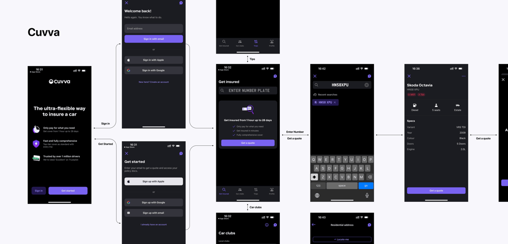
Cuvva – A modern, mobile-first product focused on short-term and flexible insurance, with a minimal, user-centered interface
Competitor Search
Competitive Audit
To design a legally compliant and user-friendly MVP, I needed to understand what already exists in the European digital insurance landscape. I selected five relevant competitors — AXA Drive, Allianz, Generali, Mapfre, and Cuvva — and audited their products with a focus on core flow structures, UI behaviors, and functionality.
UI Pattern Analysis
This sub-section focuses on the functionality and flow structures used by competitors. The goal was to understand what competitors offer overall, and more specifically, what they ask users to do at each step — such as what data to enter, what documents to upload, and when key moments like pricing or confirmation appear.
Cuvva
Cuvva is highly simplified and mobile-first. It uses short-term or on-demand insurance models. The user selects the duration and type of coverage first, enters license and vehicle info, uploads images, and receives a price in just a few screens. Its structure is minimal but functional, with very little legal friction. Functionality list:
Login / Registration
Step-by-step onboarding
Driver details entry
Vehicle details entry
Insurance duration selection or input
Document upload
Address autofill or manual input
Real-time pricing calculation
Coverage summary before payment
Legal terms acceptance
Payment processing
Downloadable or visible policy confirmation
Live chat or support access
Reminder or notification system
AXA Drive
AXA Drive focuses on usage-based insurance, but still follows a traditional onboarding structure. The app opens with a short introduction, then guides the user through vehicle and driver information entry. It offers plan summaries early and calculates pricing dynamically. Users are asked to upload documents mid-way through the flow. The app also offers policy management after purchase.
Allianz
Allianz provides a more formal, multi-step structure. It separates vehicle, driver, and coverage sections clearly, with long forms broken into short screens. Pricing is calculated at the end of the flow. Users must upload their license and vehicle registration during onboarding. Legal texts are shown clearly before purchase confirmation.
Generali
Generali uses a multi-screen flow with minimal visual distraction. The app prioritizes legal disclaimers, long explanatory texts, and step-by-step structure. Functionally, it asks for user data early, uploads in the middle, and displays final pricing only after verification. Some elements, like address lookup, are automated.
Mapfre
Mapfre offers a very straightforward process — the user enters their vehicle and personal data in sequence, uploads documents, and receives a calculated quote. The app also allows viewing coverage summaries and terms before continuing. The tone is supportive and guidance-focused.
Competitor Functionality Matrix
This matrix maps key functionalities across all reviewed competitors. The goal was to identify:
Must-have functionalities — features that all competitors include and are therefore considered standard in the market
Feature functionalities — added-value features used by some competitors to differentiate themselves
This analysis is about understanding what functionality exists in the market and how competitors position themselves through features.
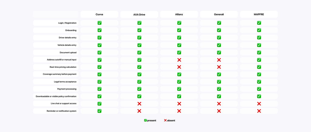
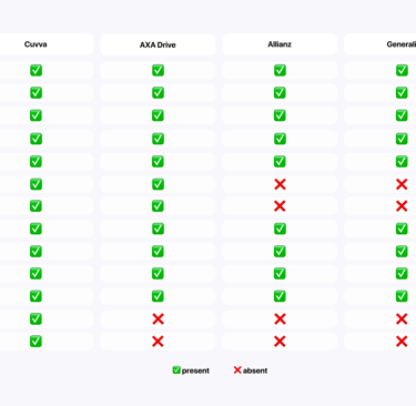
From this matrix, I identified that the must-have functionalities (present in all five competitors) include:
Login and registration
Input of vehicle and driver data
Document upload
Legal agreement and pricing summary
Payment and confirmation steps
These represent the industry baseline — functionalities users will expect and trust. Failing to include them would create friction or credibility issues.
The feature functionalities — used by some competitors to compete and differentiate — include:
Auto-fill features
Real-time price calculation
Notifications and reminders
Support access options (e.g., live chat or FAQs)
Heuristic Evaluation
This heuristic evaluation aimed to assess how user-friendly and intuitive the competing insurance apps are, using Jakob Nielsen’s 10 Usability Heuristics as the evaluation framework. The goal was to identify common usability mistakes, friction points, and best practices in the market
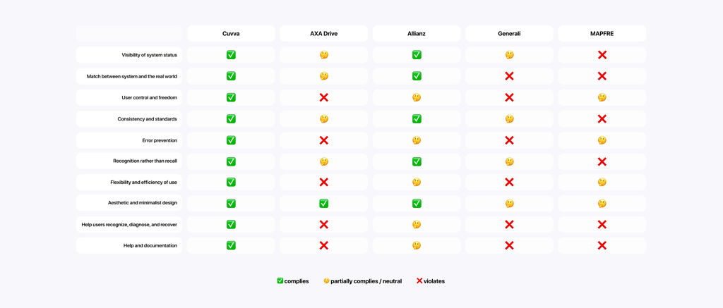
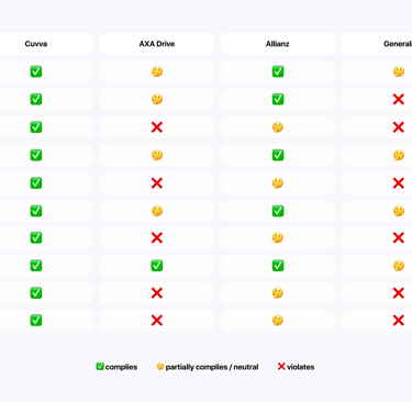
This evaluation helped surface which competitors offer polished, user-centered design — and which suffer from friction, legal overload, or confusing flows.
Cuvva stood out as the strongest in overall usability. It consistently followed best practices across all heuristics: clear status updates, intuitive navigation, real-world terminology, and simple forms. This validated minimalist design principles as a successful approach in this industry.
AXA Drive was mostly aligned with heuristic principles but occasionally suffered from minor usability issues, like limited user control during form completion or crowded layouts in pricing sections.
Allianz and Generali struggled most with usability, especially due to formal or legal-heavy language, limited flexibility in navigation, and lack of clear explanations around required documents or steps.
Mapfre was somewhere in between — offering mostly smooth experiences with only minor points of confusion.
Analyzing competitor reviews and identifying user pain points
To understand the real problems of users, I analyzed reviews in the App Store and Google Play for insurance apps. I filtered negative (1-3 stars) and positive (5 stars) reviews to identify the main pain points and positive moments.

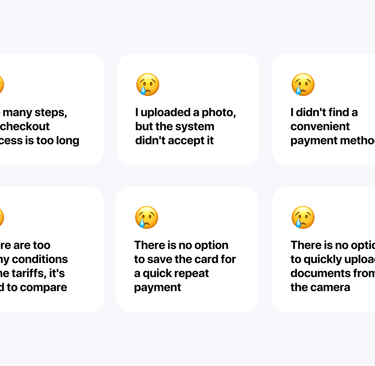
Most negative reviews are related to the lengthy registration process, the complexity of the interface and the lack of autosave. Positive reviews note the speed of registration and the convenience of managing policies. Users encounter inconvenient rates, difficulty uploading documents, an overly long registration process and a lack of convenient payment methods.
MVP Flows
Once the final scope was aligned with the client and project manager, I began working on the seven main flows that would shape the product. Each one was grounded in research and structured with attention to legal requirements, platform limitations, and user expectations.
The MVP flows included:
Onboarding
Registration
Login
Insurance price calculation
Insurance purchase
Viewing purchased insurance
Profile and settings
Each of these flows had its own logic, variations, and hypotheses — for example, handling returning users differently from first-time users, or supporting flow differences between taxis and vans. All flows were designed to be linear, minimal, and mobile-friendly.
Insurance Purchase
The insurance purchase flow was one of the most critical parts of the product. It’s where the user completes all necessary steps to activate their policy — including submitting documents, reviewing pricing, and making payment. By this stage, I had already completed a heuristic evaluation, analyzed competitor flows, and gathered real user pain points through app store reviews.
Across the market, this part of the process is often overcomplicated. Competitor apps frequently require users to re-enter information they’ve already submitted, hide the logic behind price calculations, or offer limited payment options. Reviews also pointed to common issues like failed document scanning with no fallback, unclear pricing, and friction during payment.
Problem Statement:
How might we design an insurance purchase flow that allows commercial drivers to complete their transaction quickly and confidently — with transparent pricing, minimal re-entry of data, fallback options for scanning, and convenient mobile payment methods?
With this in mind, I identified a set of user needs that would shape the structure of this flow:
Users need to complete the purchase quickly, especially under time pressure
Users need to know what is required upfront to avoid interruptions
Users need to understand how the price is calculated
Users need a fallback when scanning fails
Users need fast, familiar payment methods
Returning users don’t want to enter the same information again
Users need clear proof that coverage is active
Users need to fix mistakes easily before final submission
Users need a frictionless mobile experience
Users want to know how far they’ve come and what’s next
Understanding these user needs allowed me to formulate clear hypotheses and design targeted solutions for each one. Rather than focusing on UI elements too early, I used these hypotheses to shape the structure and logic of the flow — ensuring that every step addressed a real pain point or expectation uncovered during research. This approach helped me create a process that was not only compliant and technically feasible but also fast, understandable, and comfortable for commercial drivers to complete, even under time pressure.
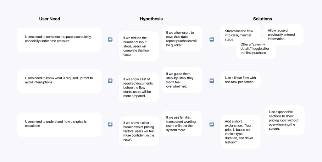
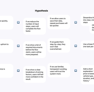
Once the solutions were defined, I began structuring the user flow
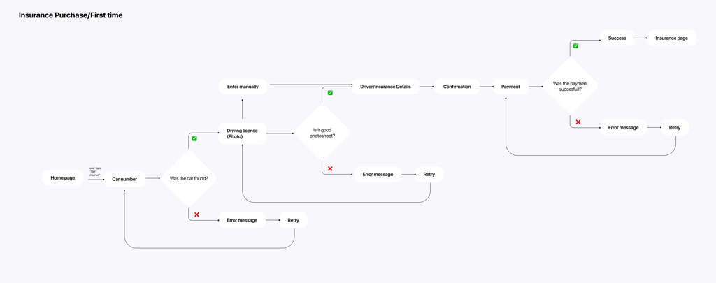
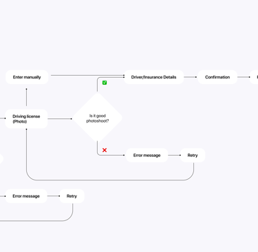
With the user flows finalized, I began creating mid-fidelity wireframes to visualize the structure.
Wireframes
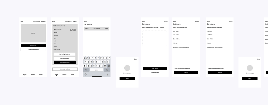
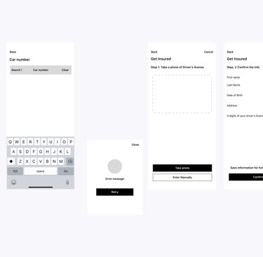
Before diving into visual design, I needed to structure the core screens and flows at a functional level — keeping the focus on clarity, speed, and user reassurance. Since the MVP included registration, quote estimation, policy purchase, and account access, I used wireframes to explore:
How to reduce visible complexity without hiding critical steps
Where to introduce smart defaults and auto-filled fields
How to visually support decision-making around plans and pricing
What the user sees first and how they move through each scenario
Keeping the layouts low-fidelity helped focus stakeholder feedback on logic and structure rather than visuals.
This stage clarified which interactions needed the most friction reduction and where users might feel uncertain or overloaded. It also helped me test how well the structure supported various user goals — from fast insurance purchase to plan comparison and profile updates.
By grounding wireframes in both user pain points and system-driven flows, I was able to make early design decisions that respected constraints while directly addressing core user needs.
Establishing Visual Consistency


Before moving into high-fidelity UI design, I created a small interface system to ensure visual consistency across the MVP. The goal was to maintain clarity, accessibility, and scalability — even within a lightweight product scope.
This included:
A modular UI kit with essential components (buttons, inputs, cards, tags)
A restrained color palette optimized for trust and readability
A typographic scale with clear visual hierarchy
Design rules for spacing, elevation, and alignment
Layout patterns aligned with mobile-first constraints
Building this structure upfront made it easier to scale the design efficiently, maintain clarity across screens, and ensure consistency between flows.